
Some example posts from my time as Reporter and What’s On Editor at Design Week.
Alibis: Sigmar Polke 1963 – 2010
“Now”, says Tate Modern curator Mark Godfrey, “we’re going to have a few words in the room with the potato house”.
Sigmar Polke, it seems, was a man slightly obsessed with potatoes. Alongside sausages and swastikas, they’re a recurring motif throughout the body of work on show at Alibis – a fantastic new retrospective of the German artist’s work at the Tate Modern.
While it would be terrifically convenient for pun-enthusiasts were the artist deeply serious – so we could reel out something about being Polke faced without resorting to a sentence this clunky – the beauty of the work is for all its hidden themes (the spectre of the Nazis, notions of oppression), Polke is brilliantly funny.
Read the full piece about the show over on Design Week
The Barbican – Digital Revolution exhibition
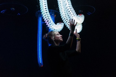
Walking into the Curve gallery that forms the focal point of the Barbican’s big, bold, screen-packed Digital Revolution show, the idea of the disruptive, immersive assault that the advent of ‘digital’ has brought into everyday life is rendered inescapable.

If the show is looking to emulate how every aspect of our senses is touched by what the Barbican terms the ‘digital Renaissance’ – screens everywhere, each person focussing on something different, sounds and visuals merging together in a disorientating cacophony – it’s undoubtedly succeeded.

The Ab Rogers-created exhibition design is certainly impressive – creating the ‘festival’ feel the Barbican was clearly looking for in such an ambitious show. There’s certainly no shortage of stimulation, be it aural, visual or tactile; and there’s a definite sense that the visitor is expected to work to truly experience the show.
Read the full piece on Design Week
Making WET: The Magazine of Gourmet Bathing
Nakedness is almost always an excellent idea.
Cleanliness is next to impossible (but keep trying anyway)
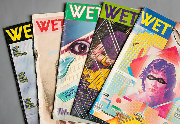
These are just a couple of the central tenets of the philosophy of bathing proposed by WET – an irreverent, hilarious, slick and, above all, beautiful publication that emerged from Venice, California, between, 1976 and 1981.
The magazine – billed by its founder and publisher Leonard Koren as ‘a five-and-a-half-year assault on good taste and linear thinking’ spanned 34 issues. Making a wry poke at ‘enthusiasm taken a bit too far’, the lovingly salacious and tongue-in-cheek graphics and artworks served an agenda to baffle, please and tease – centred around the absurdist notion of ‘gourmet bathing.
This Design Week blog looks at the new book published by WET magazine founder Leonard Koren showcases the brilliant imagery that filled the magazine’s pages, and offers an insight into the thoughts, non-sequiturs and absurdities that went into creating it.
Iconic graphic designer Vaughan Oliver on Visceral Pleasures

Iconic graphic designer Vaughan Oliver has spent more than three decades creating beautifully weird, wonderful and influential work, helping reinvent the approach to record sleeve design. Perhaps most famous for his designs for record label 4AD’s bands such as the Pixies and Cocteau Twins, Oliver’s career has also spanned work with oddball director David Lynch, and projects in fashion, film, dance and fine art.
In this piece for Design Week I chat to Oliver about ambiguity, designing for music and collaboration.
Pete Fowler’s Oceans of Fantasy

Within ten minutes of stepping into Pete Fowler’s east London studio, we’ve got both hands on a hirsute man’s antennae, triggering a barrage of noise and a hell of a lot of fun.
Surrounded by, variously, a taxidermy bird, numerous vinyl monsters, some Cristo Redentor-aping dioramas and multifarious other ephemera, the space is – much like Fowler’s work – an escapist’s paradise, full of fantastical creatures and seemingly endless ideas. Quite accurately, Fowler describes it as an ‘Aladdin’s cave’.
Read the full piece at Design Week.
